https://calligraphypen.wordpress.com/2009/04/13/demystifying-gothic-lettering/
https://calligraphypen.wordpress.com/2009/04/13/demystifying-gothic-lettering/
Demystifying Gothic Lettering
April 13, 2009 by wolfgangcat
Gothic lettering – sometimes referred to as Blackletter – is often a favorite of beginner calligraphers as it lends a sense of formality to a work. There are many variations of Gothic lettering in manuscripts – textura, prescissa, quadrata, rotunda, etc. – generally characterized by dense, vertical strokes and a variety of built-up serifs.
Historical Gothic styles are usually replaced with less mechanical, more lively variations (e.g. Compressed or “Gothicized” Italic) in contemporary calligraphy although understanding the structure and construction is a good starting point to developing variations. A beautiful example of a contemporary variation of the Fraktur style by Denis Brown can be seen at the QuillSkill website – the style is so fluid and dynamic the letters almost dance off the page!
A well-executed Gothic can be elegant and beautiful; a poorly lettered Gothic is obvious and distracting as it is much less forgiving than other styles such as Italic or Uncial.
Gothic can be very easy if you apply a few basic concepts:
- consistency
- straight, vertical strokes
- awareness of negative space
In this demonstration, we’ll use a very simplified variation of a Gothic style to practice the pen strokes and develop an understanding of consistency and negative space.
What you need:
- calligraphy pen – dip pen and ink, calligraphy fountain pen or calligraphy marker
- graph paper or guideline sheet (refer to Stroking the Rules post to create your own sheet for your pen nib size)
- scrap paper
Tip: A pen nib size of about 2mm – 3mm is easier to work with when practicing Gothic letters as it can be difficult to see serifs and counter spaces with very small nib sizes. A stiffer nib such as a Brause nib might also be easier to work with than a flexible nib.
Pen Nib Widths and Pen Angle
Gothic is a very dense, compressed style and this can be achieved with a pen angle of about 40° and pen nib widths of 4 for the x-height and 2 for the ascenders and descenders.
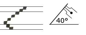
Pen Nib Widths and Pen Angle
Tip: If you are having problems with the serifs, increase the x-height to 5 pen nib widths to give yourself a little more “serif construction space.”
Basic Strokes
We’ll first practice a few basic strokes and then use the those strokes to construct letters.
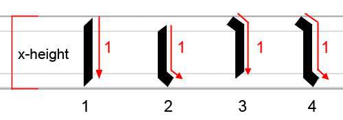
Basic Gothic Strokes
Stroke 1:
A simple straight stroke – try a row (about 3 to 5 at a time) keeping the distance between each stroke even with about a pen stroke of space between them.
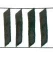
Row of First Pen Stroke
Stroke 2 – Serif Stroke at Bottom:
Start a little below the waist line (about a pen nib width), draw the straight stroke and pull the stroke to the right one pen nib width before the baseline for a serif stroke.
Stroke 3 – Serif Stroke at Top:
Start at the waist line, pull the stroke one pen nib width to the right (serif stroke) and without lifting the pen continue to about one pen nib width above the baseline.
Stroke 4 – Serif Stroke at Top and Bottom:
Start at the waist line with a serif stroke (Stroke 3), continue a straight stroke and finish with serif at the bottom (Stroke 2).
Note: Serif strokes in Gothic lettering are usually built up with the pen and vary depending on the letter style. The simplified serifs in this demonstration can also be built up by adding the serif strokes as separate pen strokes.
Building Letters
With these few basic strokes, we now have enough to almost build an entire alphabet with a just few exceptions. Letters such as the “a”, “k”, “s”, “x” and “z” will be discussed in the “Special Letters” section.
Note: The examples were lettered using a 3mm Brause nib with an x-height of 5 pen nib widths and 2 pen nib widths for the ascenders and descenders.
Letters “i” and “l”
As you might have noticed, we have already written two letters with Basic Stroke 4 – the letter “i”, and if we extend the stroke to an ascender, the letter “l”. The “dots” over the “i” and “j” are a hairline stroke with the pen angle at 40° or 45°.
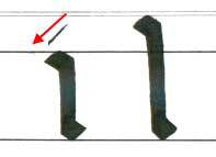
Letters “i” and “l”
Letter “o”
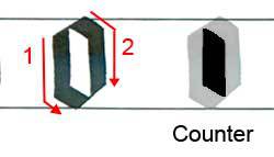
Next, we’ll build a letter “o” using Strokes 2 and 3. This will establish the counter (negative space) for similar letters and also help with letter spacing.
Letter “o” and Counter Shape
Note the parallelogram shape of the counter space and try to maintain this shape as you practice the letters. Common problems with Gothic lettering can often be identified and corrected by looking at the counters and negative space.

Common Construction Problems and Counter Spaces
In the above example of common construction problems, compare the counter spaces of each problem to the shape of the counter space in the exemplar letter “o”. It is quite easy to see the problems if we look at the counter spaces and not just the pen strokes.
Practice a few rows of the letter “o” until you are comfortable with the serif construction and looking at the counter space.
Letters “n”, “m”, “u”
We’ll use Stroke 4 to construct the letters “n”, “m” and “u”.

Letters “n”, “m” and “u” with Stroke 4
With these letters and the letter “i”, we’ll write out the word “minimum” to check the serif contruction, strokes and negative space.

“minimum”
This is also a good example of how Gothic can be difficult to read!
Grab two pieces of scrap paper, and place one covering the serifs at the top and one covering the bottom serifs. You should see a row of fairly straight lines with even spacing (negative space) between the strokes.

“mimimum” with Covered Serifs
Letter “h”
The letters “l” and “i” (Stroke 4) – remember to watch the lines, counter space and keep the serifs short with longer vertical strokes.
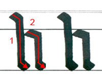
Letter “h”
Letters “v” and “w” using Strokes 4 and 3.
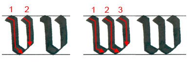
Letters “v” and “w”
Letter “b” using Strokes 4 (or the “l” stroke) and Stroke 3.
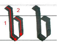
Letter “b”
Letters “c”, “e” and “r” starting with Stroke 2 and adding a serif stroke. Note the hairline extension of Stroke 2 at the bottom of the “c” and “e” stroke, and at the end of the second “r” stroke.

Letters “c”, “e” and “r”
Letters “g”, “j” and “p” extend Stroke 3 to descender length. The “g” and “j” add serif strokes for the tails. The “p” stroke adds a bit of a hairline at the bottom and the horizontal stroke (#3) is straight.

Letters “g”, “j” and “p”
Letters “y” and “q” with “y” a combination of Stroke 4 and the “j” stroke. Note the hairline stroke at the end of the “q”.
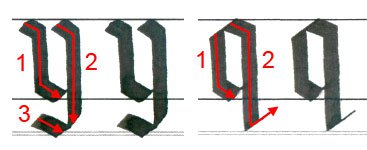
Letters “y” and “q”
Letters “t”, “f” and “d”. The “t” and “f” crossbars are under the waist line. The second stroke of the “d” starts above the waist line and continues as the second stroke of the letter “o”.

Letters “t”, “f” and “d”
Special Letters
Letters “a”, “k”, “x” and “z” are constructed with modified variations of the basic strokes.
Letter “a” – the first “a” is a very simple variation using Strokes 2 and 4. The Gothic “a” is constructed by using Stroke 4, then adding a shortened version of Stroke 2. The thin line creating the “bowl” is done by using the edge of pen to draw the line beginning inside the top serif to the top of Stroke 2.
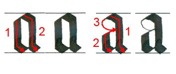
Simple “a” and Gothic “a”
Letters “k” and “s”. Notice the top half of the letters are above the center of the x-height.
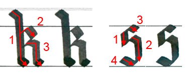
Letters “k” and “s”
Letters “x” and “z”. There are many variations of the “x” and “z” – these are simple constructions to fit with the rest of the letter style.
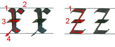
Letters “x” and “z”
Now let’s try putting it all together in a quote by Richard Torregrossa:

Quote by Richard Torregrossa in Gothic Lettering
The quote has more generous spacing between the words than is usually found in manuscripts to help with legibility.
Gothic lettering can be quite complex with compressed proportions and letter spacing, changes in pen angles, and built-up serif construction. This simplified variation of a Gothic style is helpful as a starting point to become aware of how lettering is constructed by focusing on negative space and minimal serifs.
Once you are comfortable with basic construction techniques, look at images of Gothic lettering in manuscripts or at the British Library Digital Catalogue of Illuminated Manuscripts (enter “1300” or “1400” in the search box to see a variety and range of Gothic styles), or try combining Gothic lettering with a Simple Painted Initial.